A scatter chart pairs two variables to show if there is a relationship between them. If a correlation is found, a line or curved shape will be seen on the graph.
Summary
A scatter chart has two numeric variables: an independent and a dependent variable. Common practice dictates, the horizontal axis is the independent variable, and the vertical axis is the dependent variable. To show relationships, the scatter chart can have positive or negative, strong or weak, and linear or nonlinear correlations. When interpreting a scatter plot, remember that correlation does not imply causation. There could be a third variable affecting both plotted variables.
Procedure
- On Add Widget, look for the Scatter Chart widget. A popup should appear that looks like the photo below
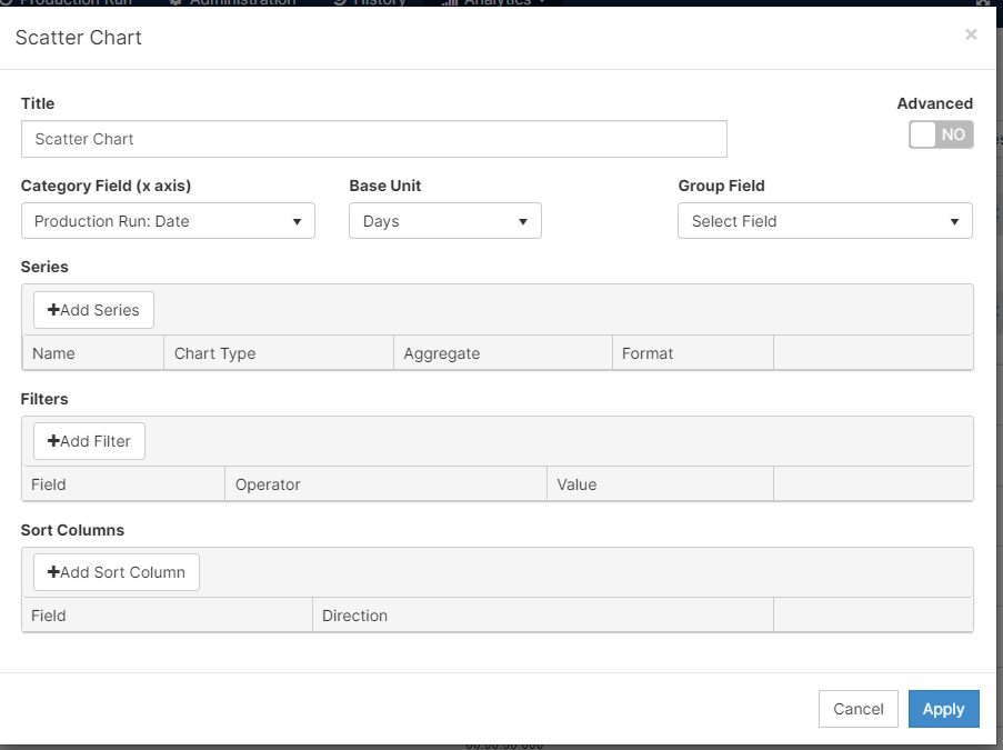
- After adding a Title to your graph, select the variable you would like in your Category Field (or x-axis) from the dropdown menu. According to the Category Field you choose, you would have a dropdown with the Base Units you could use.
- Add a Series or the values you would like to see plotted on the graph.
- Filters can be added if needed
- Remember to [click] Apply your changes when you finish
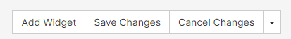
- After you see what your graph would look like, remember to Save Changes in the top right corner.
Features
- To duplicate this widget, please select (
 ) when you are in edit mode.
 - Understand and modify the widget's details by clicking on the Fullscreen button (
 )
)
- On the pop-up screen, there are two options: Export Image and View Details
- Export Image: exports the selected image to your computer
- View Details: examine scrap codes and downtime codes to understand the widget's summary
- you can export to excel on this screen
- On the pop-up screen, there are two options: Export Image and View Details