Dashboard Widget: Pie or Donut Chart
A Pie or Donut chart summarizes nominal data and displays the components parts of a whole.
Process
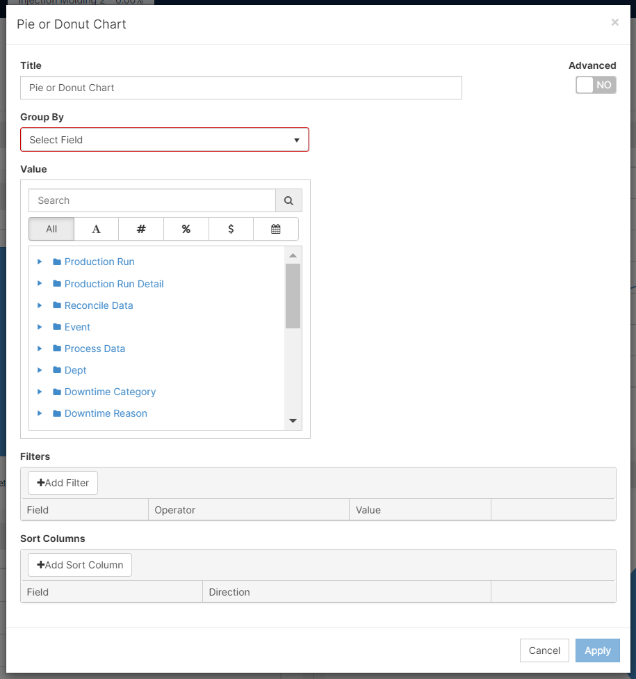
- On Add Widget , look for the Pie or Donut Chart widget. A popup should appear that looks like the photo below:
- Change the title by clicking on the preselected one and deleting the characters. For this example, we are going to look at "Planned vs Unplanned Downtime".
- Since I want the downtimes to group by Planned and Unplanned. I selected group by " Downtime Reason: Type". To populate your graph, you have to select the Value that is going to fit your analysis and reporting. I want the value to be the overall amount of minutes I spent on either Planned or Unplanned downtime. Hence, why I decided to aggregate by Sum.
Note: Choosing Pie or Donut will not affect the values of the graph, just how you display them.
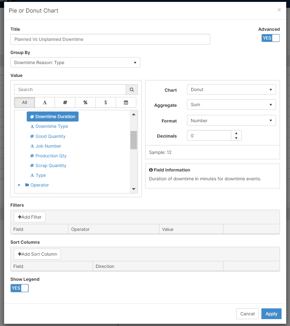
- You can also Add Filters and Add Sort Column to display your data as you would like to report it.
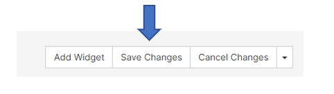
- [Click] Apply and remember to Save your work on the upper right corner.
Features
- Understand and modify the widget's details by clicking on the Fullscreen button (
 )
)
- On the pop-up screen, there are two options: Export Image and View Details
- Export Image: exports the selected image to your computer
- View Details: examine scrap codes and downtime codes to understand the widget's summary
- you can export to excel on this screen