Dashboard Widget: Pareto Chart
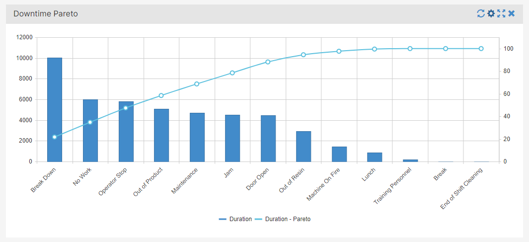
A Pareto Chart contains two charts in one: columns sorted in a descending order and a line with cumulative total percentages. Pareto Charts are utilized to clearly identify the most common problems or issues.
Procedure
- On Add Widget, look for the Pareto Chart widget. A popup should appear that looks like the photo below

- For this example, we want to know what downtime event is affecting our production and with what frequency. Let's first change the title to "Downtime Pareto".
- From the dropdown menu, select the category you want the bar chart to be grouped by.
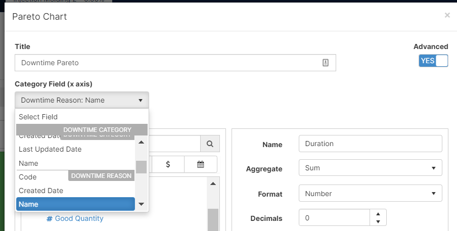
Note: if the Advanced switch is on, you can select the Maximum amount of categories you see in your chart
- Select the Metric you want the bar chart to be populated with.
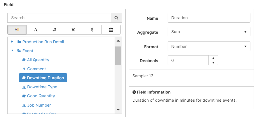
Once you select your Metric you can decide the name, how you want to aggregate it, the format, and the amount of decimals. The Field Information provides an overview of the Metric you selected.
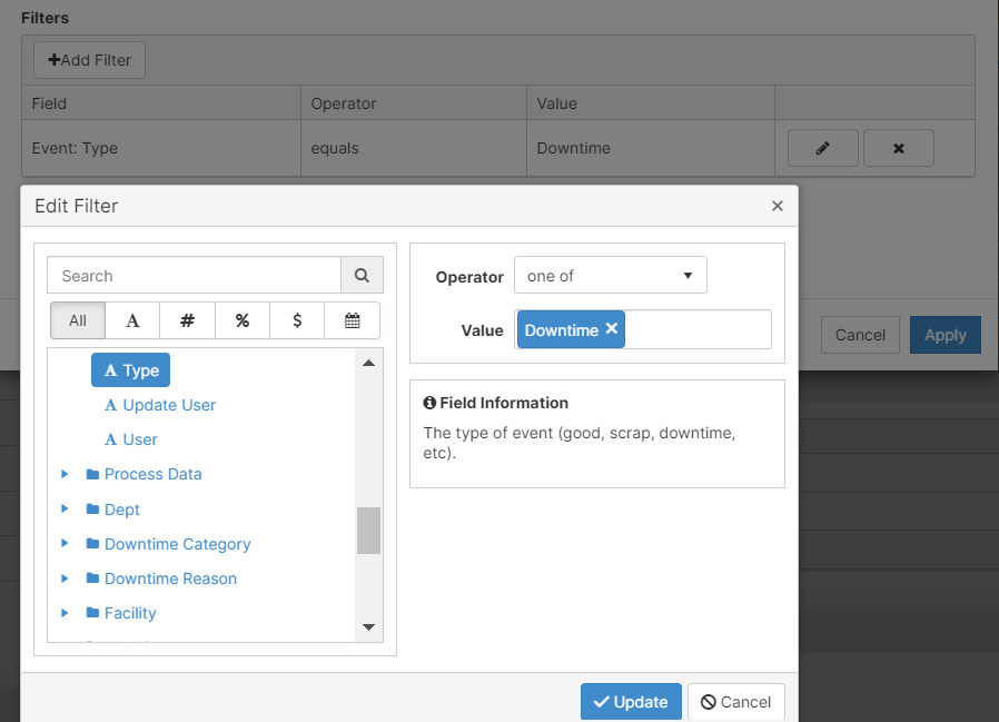
- Add a filter to exclude information not relevant to your analysis. In this case, we are only interested in Downtime Events.
- The graph updates according to the information it receives from the production runs.
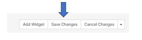
- [Click] Apply and remember to Save your work on the upper right corner.
Features
- Understand and modify the widget's details by clicking on the Fullscreen button (
 )
)
- On the pop-up screen, there are two options: Export Image and View Details
- Export Image: exports the selected image to your computer
- View Details: examine scrap codes and downtime codes to understand the widget's summary
- you can export to excel on this screen