Dashboard Widget: Line/Bar/Area Chart
Line Charts display quantitative individual data points over a specified time interval. Bar Charts represent independent numerical values with equal width rectangles. Area Charts are the same as a Line Graph; however, the area underneath is colored.
Procedure
- On Add Widget, look for the Line/Bar/ Area Chart widget. A popup should appear that looks like the photo below
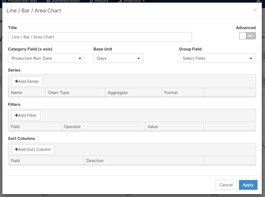
- Select a Title that best fits your graph. For example, it can be "Good Vs. Scrap Quantities"
- On the X-axis, or the horizontal plane, an option for a metric is Production Run: Date. This metric ties the date of the production run with the quantities reported.
- There are multiple ways to display data on the X-axis. The Base Units are Fit, Seconds, Minutes, Hours, Days, Weeks, Months, and Years. The fit option will automatically fit the dates to display the graph.
- The Group Field classifies the aggregated data. For example, if you would like to distinguish between the machines, instead of having an aggregated metric with all of the machines. Select Name on the Machine Folder.

- Mingo provides different options to display your Series or values. First, select the metric you would like to display. After choosing your metric's Name, the Chart dropdown menu is where you choose between a Line, Bar, or Area chart to display your data.

 A Line graph is used to emphasize changes in values for one variable (represented on the y-axis or vertical axis) that are affected by a continuous variable (represented on the x-axis). For example, your x-axis might be the production run date, and the change in value on your y-axis might be the amount of quantity produced per day.
The only difference between Line and Area graphs is that Area graphs have a solid color underneath the trend line.
Bar charts, on the other hand, are best used to compare metric values across different subgroups, show the distribution of data points, and represent large amounts of discrete categorical variables.
- With each Series, you have the option of stacking your individual quantities to represent your overall quantity. [Click] on Advanced and turn on the Stack option.
 The graph will look something like this:

- You can Add Filters and Add a Sort Column. For this type of graphs, I would recommend using the filters rather than the sorting function, if needed.
- Click Apply to see how your graph looks like in your dashboard
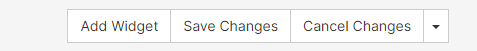
- Remember to Save Changes on the top right corner
Features
- Understand and modify the widget's details by clicking on the Fullscreen button (
 )
)
- On the pop-up screen, there are two options: Export Image and View Details
- Export Image: exports the selected image to your computer
- View Details: examine scrap codes and downtime codes to understand the widget's summary
- you can export to excel on this screen