Control charts have an average center line, an upper line for Upper Control Limit (UCL), and a lower line for Lower Control Limit (LCL). These lines help correct ongoing processes by easily distinguishing when a process is not in statistical control.
Summary
Control charts help the team visualize if an ongoing process needs correction. Once a data point breaks any of the control limits, the system is not stable (or has no statistical control). Control charts are mainly used to analyze patterns of process variation. This variation comes from non-routine events or common causes.
Procedure
- On Add Widget, look for the Control Chart widget. A popup should appear that looks like the photo below
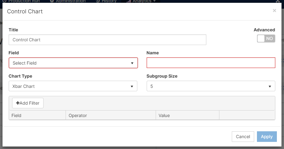
- After adding a Title, select a Field from the dropdown menu. Add a Name for the field.
- There are 3 chart options on Mingo: Xbar, R chart, and S chart.
Xbar charts are used on continuous data paired in subgroups. This graph is used to identify and correct instabilities. The process variation has to be in control before you use Xbar charts (you can use R and S charts to know if the variation is in control).
R charts monitor the variation in Range. When you have continuous data and a subgroup of 8 or fewer, you can monitor if the product remains within the center line or is approaching one of the controls. For example, if you do a weight test on your product, and one of the subgroups is out of the upper control line. You might be using more products than the recipe needs. This creates costs to rise and materials to be replenished before time.
S charts pay close attention to a change in standard deviation. These graphs are used on continuous data and subgroups size 9 or more. - The Subgroup Size is the amount of data points you will have per point in the graph. For example, if a test requires three samples from production at a time every hour, you will have a subgroup size of 3 every time you run a test on the line.
- Add a Filter if needed.
- [Click] Apply
- The chart will look something like this:
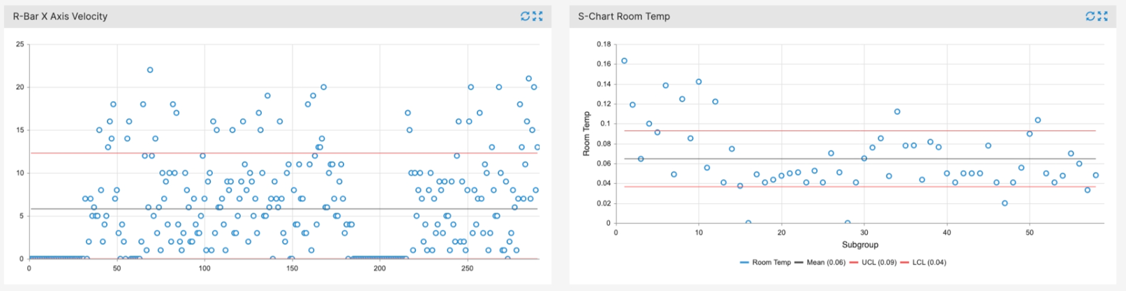
Note: this process is not under control since the subgroups are outside the control limits - Remember to Save your changes in the top right corner
Features
- Understand and modify the widget's details by clicking on the Fullscreen button (
 )
)
- On the pop-up screen, there are two options: Export Image and View Details
- Export Image: exports the selected image to your computer
- View Details: examine scrap codes and downtime codes to understand the widget's summary
- you can export to excel on this screen
- On the pop-up screen, there are two options: Export Image and View Details